
The association between autism and colours has been a long-standing one, with various colours having a particular effect on those with the condition. In this guide, we will cover which are the autism-friendly colours, and therefore which is the best room colour for autism. We’ll also include sensory products that are autism-friendly and can be used as part of autism colour therapy in a sensory room.
What Colours are Best for Autism?
Before you even begin to consider which colours are autism-friendly, you must think about style. Bold patterns and primary or very bright colour tones should only be limited to toys in a room. All of these can cause overstimulation in any space and, in particular, a sensory room. So what colours are the most autism-friendly, and what colour should a sensory room be for an autistic user?
Autism Friendly Colours Include:
Pinks and Lilacs
Both pastel pinks and lilacs can positively affect autistic users, with both colours creating the feeling of safety and love. The pastel tones evoke a peaceful feeling, which can sometimes cause someone with autism to adopt a tranquil state. Hence, it is one of the best colours for a bedroom or calming sensory room for users with autism.
Greens and Blues
When it comes to calming colours for autism, muted tones of greens and blues are a great choice. They have much shorter wavelengths than brighter colours, meaning much less stimulation in the brain occurs. Softer tones of greens and blues banish the feeling of chaos and often soothe people who have various sensory conditions, including autism. Introducing greens and blues and reducing over-stimulation can help autistic users in a sensory room truly digest and process the environment.
Oranges
Soft, muted oranges can be autism-friendly colours, providing comforting warmth. In fact, using soft orange tones in the kitchen or dining room can stimulate appetite and help mealtimes go more smoothly.
Neutrals
Colours such as beige, greys, creams or tans are great for people with autism; they’re not distracting and therefore can have a calming effect. White, however, is not an autism-friendly colour – although it is neutral, it can be too bright and tiring for the eyes. Besides, for children with autism, white can be clinical and remind them of visits to hospitals and medical centres where they may have been uncomfortable.
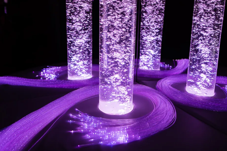
If you want to create a sensory bedroom, then we recommend adding a bubble tube, fibre optics or Aurora LED projector to complement the space.
Visit our knowledge hub to see guides covering sensory room planning, sensory room design, sensory room cost and much more.
Colours to Avoid for Autism Include:
There are many autism-friendly colours, but there are also colours to avoid to help those with autism. Generally, bright and fluorescent colours can leave those who are autistic feeling distracted and unable to focus. In particular, fluorescent lighting can cause irritation and headaches, leaving some feeling disorientated and confused.
Reds
The colour red, in particular, can have quite a strong effect on those who are autistic as they might perceive red as fluorescent. Referred to as a high-energy colour, it can increase blood pressure resulting in tension or hyper action. Red is also sometimes associated with parts of the body that are in pain, which can trigger meltdowns or general upset.
Yellows
Similarly to red, yellow can be overstimulating for people with autism and therefore should also be avoided as it could trigger a reaction in a person with autism. Both colours must be avoided in an autistic person’s sensory space to make the user feel more comfortable and fully benefit from their sensory experience.
Knowing which colours are autism-friendly can help you create a space that is uniquely suited to a user. If you are designing a room for one user, take their preferences into account. However, if your space will be used in a commercial or shared setting, this guide will help you create an inclusive space for most people.
Should you wish to seek advice on designing and planning a sensory space to ensure autism-friendly colours are used and the space is beneficial then please contact our expert team.